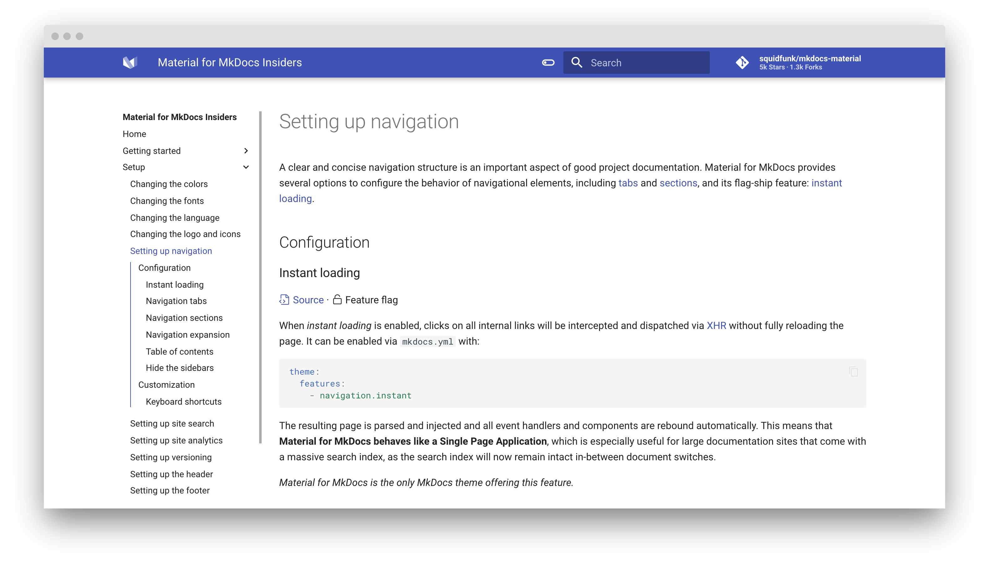
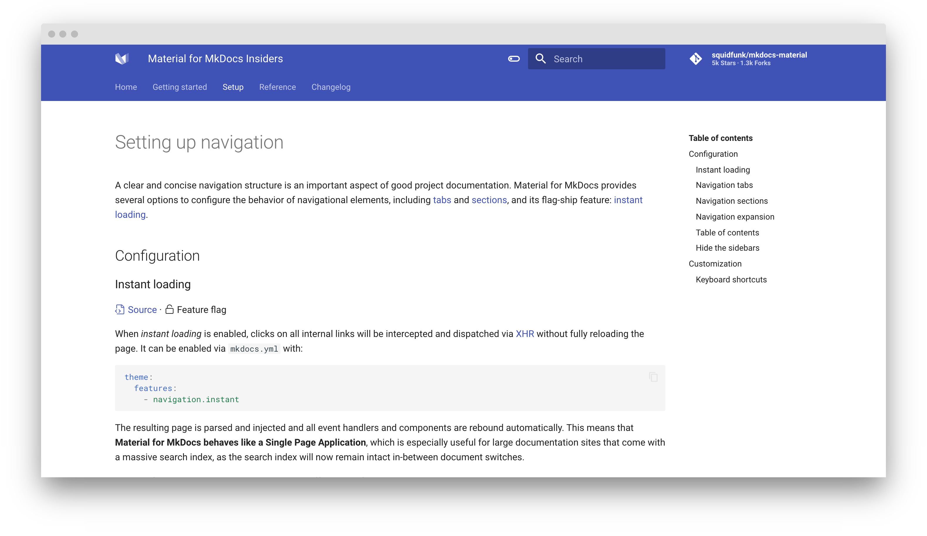
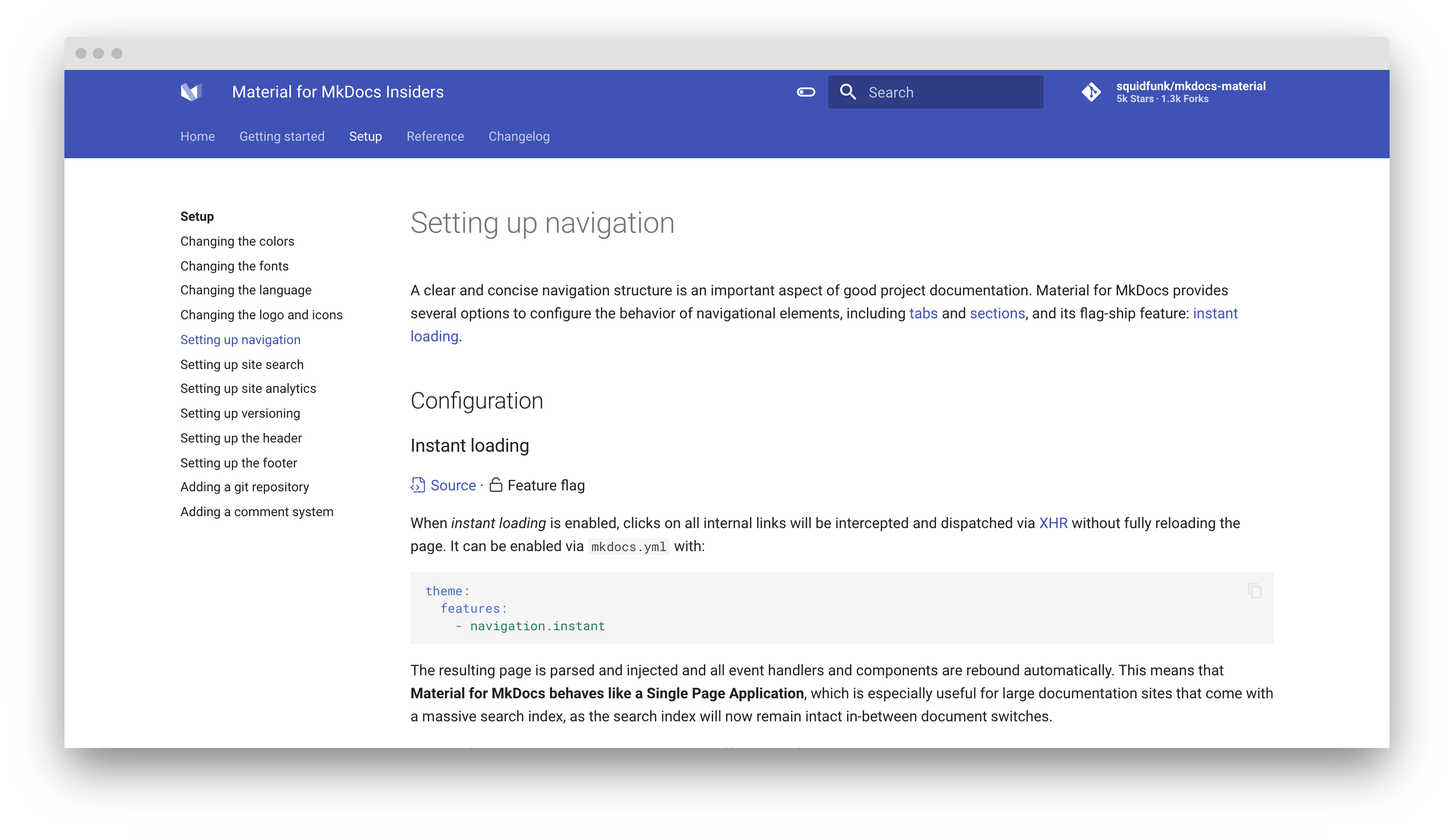
Setting up navigation
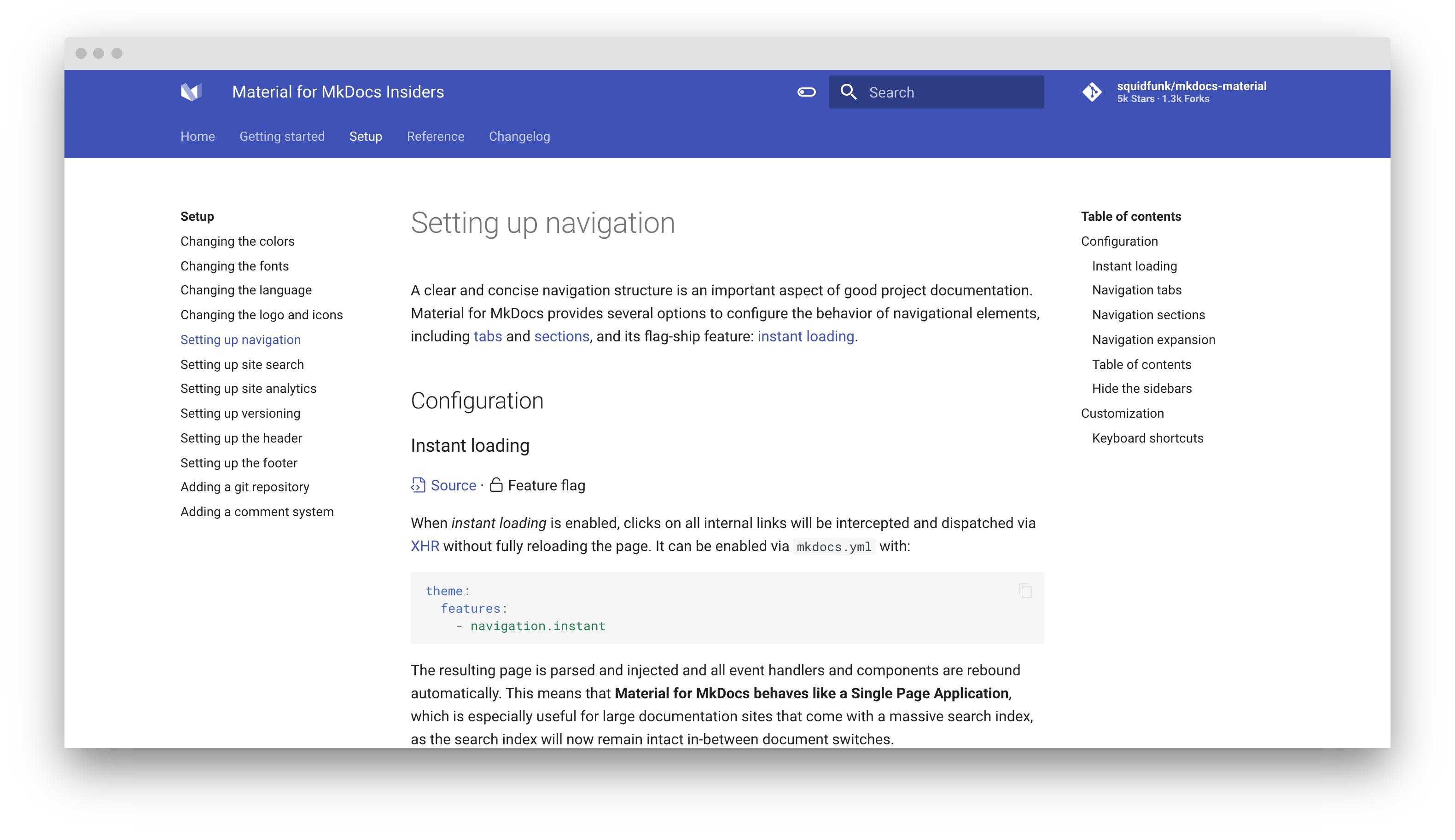
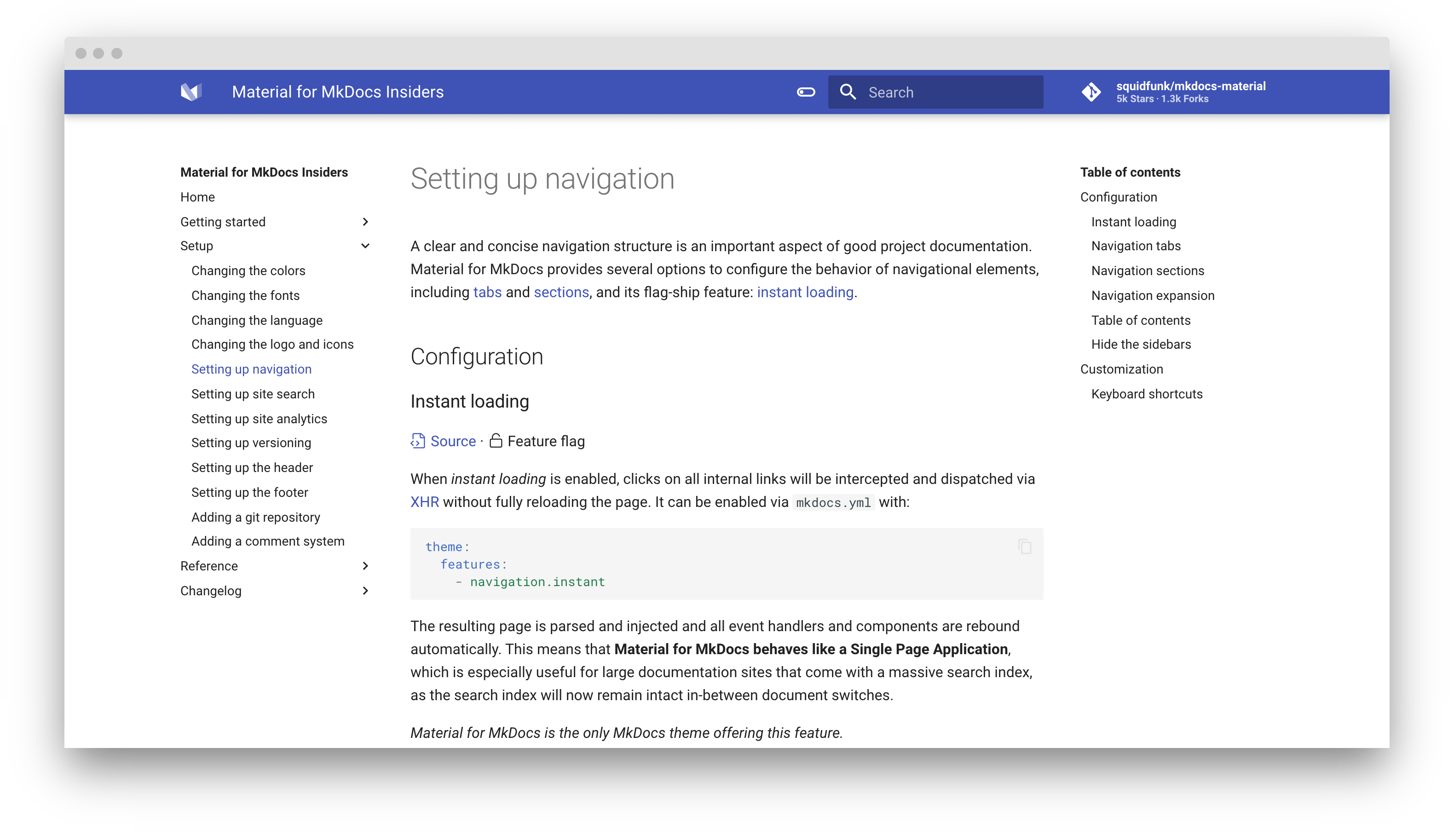
A clear and concise navigation structure is an important aspect of good project documentation. Material for MkDocs provides a multitude of options to configure the behavior of navigational elements, including tabs and sections, and its flag-ship feature: instant loading.
Configuration
Instant loading
Source · Feature flag
When instant loading is enabled, clicks on all internal links will be intercepted and dispatched via XHR without fully reloading the page. It can be enabled via mkdocs.yml with:
theme:
  features:
    - navigation.instant
The resulting page is parsed and injected and all event handlers and components are rebound automatically. This means that Material for MkDocs behaves like a Single Page Application, which is especially useful for large documentation sites that come with a massive search index, as the search index will now remain intact in-between document switches.
Material for MkDocs is the only MkDocs theme offering this feature.
Navigation tabs
Source · Feature flag
When tabs are enabled, top-level sections are rendered in a menu layer below the header for viewports above 1220px, but remain as-is on mobile. They can be enabled via mkdocs.yml with:
theme:
  features:
    - navigation.tabs
Note that all top-level pages (i.e. all top-level entries that directly refer to an *.md file) defined inside the nav entry of mkdocs.yml will be grouped under the first tab which will receive the title of the first page.
This means that there will effectively be no collapsible subsections for the first tab, because each subsection is rendered as another tab. If you want more fine-grained control, i.e. collapsible subsections for the first tab, you can use top-level sections, so that the top-level is entirely made up of sections. This is illustrated in the following example:
nav:
  - Tab 1 + Page 1.1
  - Page 1.2
  - Tab 2:
    - Page 2.1
    - Page 2.2
    - Page 2.3
  - Page 1.3
nav:
  - Tab 1:
    - Page 1.1
    - Page 1.2
    - Page 1.3
  - Tab 2:
    - Page 2.1
    - Page 2.2
    - Page 2.3
Also note that tabs are only shown for larger screens, so make sure that navigation is plausible on mobile devices. As another example, see the mkdocs.yml used to render these pages.
Navigation sections
Source · Feature flag · Insiders only
When sections are enabled, top-level sections are rendered as groups in the sidebar for viewports above 1220px, but remain as-is on mobile. They can also be enabled via mkdocs.yml:
theme:
  features:
    - navigation.sections
Both feature flags, tabs and sections, can be combined with each other. If both feature flags are enabled, sections are rendered for 2nd level navigation items.
Navigation expansion
Source · Feature flag · Insiders only
When expansion is enabled, the left sidebar will expand all collapsible subsections by default, so the user doesn't have to open subsections manually. It can be enabled via mkdocs.yml with:
theme:
  features:
    - navigation.expand
Table of contents
The Table of contents extension, which is part of the standard Markdown library, provides some options that are supported by Material for MkDocs to customize its appearance:
permalink-
Default:
false– This option adds an anchor link containing the paragraph symbol¶or another custom symbol at the end of each headline, exactly like on the page you're currently viewing, which Material for MkDocs will make appear on hover:markdown_extensions: - toc: permalink: truemarkdown_extensions: - toc: permalink: ⚓︎ slugify-
Default:
headerid.slugify– This option allows for customization of the slug function. For some languages, the default may not produce good and readable identifiers. Consider using another slug function like for example those from Python Markdown Extensions:markdown_extensions: - toc: slugify: !!python/name:pymdownx.slugs.uslugifymarkdown_extensions: - toc: slugify: !!python/name:pymdownx.slugs.uslugify_cased toc_depth-
Default:
6– Define the range of levels to be included in the table of contents. This may be useful for project documentation with deeply structured headings to decrease the length of the table of contents, or to remove the table of contents altogether:markdown_extensions: - toc: toc_depth: 3markdown_extensions: - toc: toc_depth: 0Note that MkDocs will not generate anchor links for levels outside the range defined with
toc_depth. However, Material for MkDocs also allows to hide the table of contents on a specific page while keeping permalinks.
Material for MkDocs doesn't provide official support for the other options of this extension, so they may be supported but can also yield weird results. Use them at your own risk.
Navigation integration
Source · Feature flag · Insiders only
When integration is enabled, the table of contents is rendered as part of the navigation for viewports above 1220px, but remain as-is on mobile. This can be enabled via mkdocs.yml:
theme:
  features:
    - toc.integrate
The content section will now always stretch to the right side, resulting in more space for your content. This feature flag can be combined with all other feature flags, e.g. tabs and sections.
Hide the sidebars
Sometimes it's desirable to hide the navigation and/or table of contents sidebar, especially when there's a single navigation item. This can be done for any page using the Metadata extension:
---
hide:
  - navigation # Hide navigation
  - toc        # Hide table of contents
---

...
Customization
Keyboard shortcuts
Source · Difficulty: easy
Material for MkDocs includes several keyboard shortcuts that make it possible to navigate your project documentation via keyboard. There're two modes:
search-
This mode is active when the search is focused. It provides several key bindings to make search accessible and navigable via keyboard:
- Down , Up : select next / previous result
- Esc , Tab : close search dialog
- Enter : follow selected result
global-
This mode is active when search is not focussed and when there's no other focussed element that is susceptible to keyboard input. The following keys are bound:
- F , S , / : open search dialog
- P , , : go to previous page
- N , . : go to next page
Let's say you want to bind some action to the X key. By using additional JavaScript, you can subscribe to the keyboard$ observable and attach your custom event listener:
app.keyboard$.subscribe(function(key) {
  if (key.mode === "global" && key.type === "x") {
    /* Add custom keyboard handler here */
    key.claim()
  }
})
The call to key.claim() will essentially execute preventDefault() on the underlying event, so the keypress will not propagate further and touch other event listeners.
Content area width
Source · Difficulty: easy
The width of the content area is set so the length of each line doesn't exceed 80-100 characters, depending on the width of the characters. While this is a reasonable default, as longer lines tend to be harder to read, it may be desirable to increase the overall width of the content area, or even make it stretch to the entire available space.
This can easily be achieved with an additional stylesheet and a few lines of CSS:
.md-grid {
  max-width: 1440px;
}
.md-grid {
  max-width: initial;
}